Schedule a consultation
Branding
Campaign
Production
Web development
Business Consulting
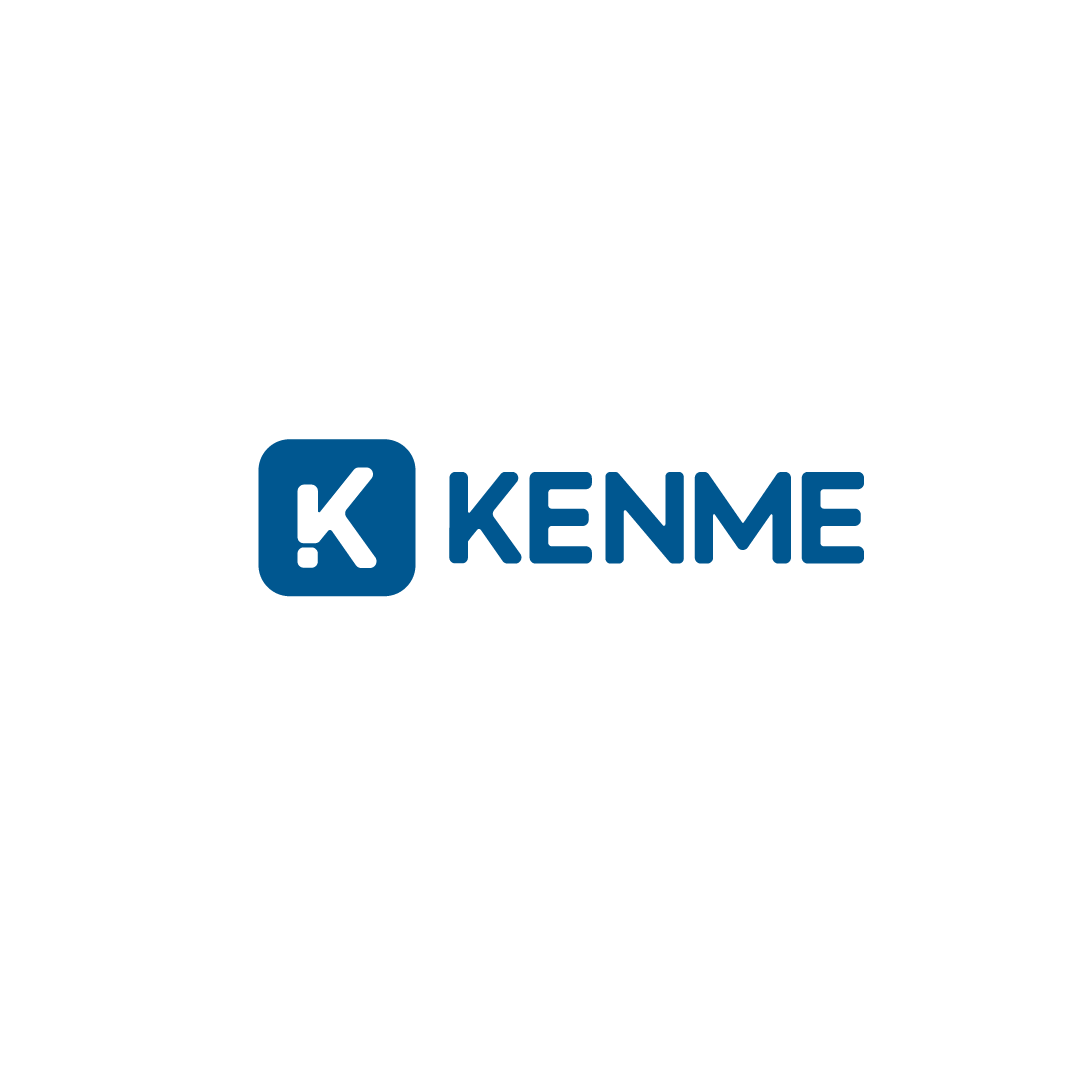
We’ve reimagined Kenme with a bold, refreshed identity — one that not only reflects its multi-faceted purpose but also brings its personality to life with clarity and confidence. At the heart of this rebrand is a modern logo that serves as a unifying symbol across all of Kenme’s growing verticals.
The new Kenme logo is a clever fusion of symbolism and simplicity. At its core is the letter ‘K’, standing firmly for the brand name. Seamlessly integrated into this form is a tick mark, a globally recognized symbol
Correctness and accuracy
Accomplishment and progress
Validation and trust
Kenme isn’t just a single offering — it’s an ecosystem. The rebrand was carefully crafted to ensure visual and conceptual consistency across its verticals:
Kenme English Online – Empowering global learners through flexible, high-quality English language education.
Kenme Study Abroad – Guiding aspirational students toward international academic opportunities.
Kenme Digital Academy – Bridging future-ready skills with real-world relevance in a digital-first environment.


WhatsApp us