Nestled in the tranquil landscapes of Wayanad, Panorica is more than a destination it is a harmonious blend of nature’s grandeur and human retreat
Derived from the word panorama, Panorica captures the vast beauty of unspoiled natural views — endless greens, open skies, and the quiet rhythm of the land. It’s a name that invites the soul to pause, breathe, and reconnect with the essence of living.
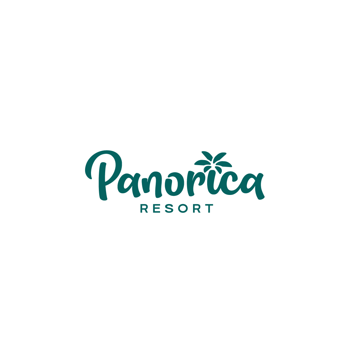
At the heart of the brand’s logo lies a subtle yet impactful design move — the letter ‘I’ in Panorica transformed into a palm tree. This clever visual metaphor holds deep meaning
Relaxation & Leisure: The palm is a universal symbol of tropical charm and peaceful getaways.
Timeless Escape: It evokes imagery of gentle breezes, soft sunshine, and stillness that nourishes the spirit.
Local Connection: Though palms are not exclusive to Wayanad, their elegance and simplicity align with the mood of the region — serene, welcoming, and rich in natural detail.


WhatsApp us